Is Something Hiding in the New Logo For Channel 3 in Philadelphia, PA?
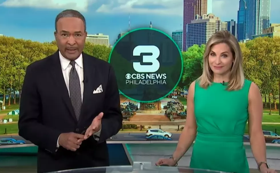
Channel 3 in Philadelphia has been in the news itself this week because it dropped its "Eyewitness News" brand after six decades, now calling itself "CBS News Philadelphia."
As you would expect, with the name change comes new graphics for their newscasts, plus a new logo for the station.
But there's something about that logo that caught my eye. Have you seen it?
I think there's something hiding in it.
Brands of all shapes and sizes like to sometimes hide things in their logos to imply what their business is about. For example, FedEx is known for having a hidden forward-facing or moving arrow in its logo.

That implies that FedEx is always moving forward and getting your stuff to you as quickly as possible.
If you look at Wendy on a Wendy's sign, you'll see the word "mom"...

Officially, Wendy's has said that "mom" in their logo is intentional but it doesn't actually mean anything, but to some, "mom" implies good food and a friendly place.
So, what about the new logo for Channel 3 in Philly?
The first thing you'll notice is that it's green. No one uses a green logo on TV. And that was part of their plan.
According to Newscast Studio, a TV news trade publication,
That green, while immediately invoking imagery of a certain Philadelphia NFL team, was actually chosen to help differentiate the station given the dominance of blue in television news.
Kelly Frank, President and GM for CBS Philadelphia told the publication,
“There was intention in that and we looked at two to three different palettes. … The idea was to not be offensive, but to create balance and color that connected to what we’re trying to accomplish.”
So, officially, Channel 3's decision to go with a green logo had nothing to do with how big the Philadelphia Eagles are across the region (and, apparently, the color green isn't offensive).
But is that really true, given what I think is hidden in it?
I was sitting here staring at the "3" this morning, thinking to myself that it isn't very friendly looking. It's rather bold and prominent, in my opinion, but that's probably the look they're going for.
That style of "3" seems like an odd choice, especially since lots of brands and businesses have been going with softer-looking fonts lately (i.e. Walmart and Target both formerly used all capital letters on their signs, now they use softer-looking lower-case letters).

After looking at it for a while, I accidentally glanced at their logo sideways.
Is that a football goalpost hidden inside of the 3?

Now that I see that, that's all that I see.

If green is a huge color in and around Philadelphia, and the Eagles are insanely popular, did KYW really "go green" to indirectly parallel itself with the Eagles' powerful look -- and then embed a football reference in their logo to take it one step further?
I'll be the first to admit that this is conspiracy theorist-level guessing on my part, but, again, now that I see that goalpost in the "3," that's all that I see.
Do you remember these 17 legendary reporters and anchors from Channel 6 in Philadelphia?
More From SoJO 104.9 FM